A new brand to reflect the Dodge Poetry Festival’s move from rural Waterloo, NJ to vibrant, urban Newark, NJ. Plus a design that could: A) accommodate posters of various sizes, mailing collateral, web ads, merchandise, signage and advertising, B) allow for updates for future festivals, but still be recognizable as the same event, C) feature photos of previous festivals to showcase the large crowds and famous poets, and oh, no quills, calligraphy, or books.
That’s what the Dodge Poetry Festival, a bi-annual 3-day celebration of poetry that draws 150,000+ people to hear acclaimed poets from around the world, needed.
No small order! But 501c is always up for a fun challenge.
Kerstin created a new brand identity bringing in color, pattern, and bold graphics to evoke the Festival’s exuberance and joy. To keep consistency from year to year, Kerstin maintained the same typography. But each year features a new motif: 2014 ‘shouted out’ the Festival’s elation with a megaphone, 2016 drew on the city’s skyline rendered in the brand’s eye-catching colors, and in 2018, a map of Newark led to a colorful mosaic. For 2020, the Festival went virtual — the 2020 design is pared down to work best with small screens (rather than large posters) but keeps the joy alive with colorful graphics, and a focus on the poets. Still not a quill in sight.
CLIENT
Dodge Poetry
PROJECT SCOPE
New brand identity – logo, colors, typography, marketing materials – fliers, posters, program book, etc., NJ Transit ad campaigns, print materials and web banners, event signage, and digital marketing design.
TAKE AWAYS
- A new logo lockup each year changes things up, while the same typography brings consistency.
- Bold, modern, and fun designs emphasize that poetry is meant to be “experienced” not read in a dusty library.
- A new custom motif that builds on the Festival’s brand for a fresh look each year (2014, 2016, 2018, and 2020.)
- End-result: More people coming to the events, and greater awareness of the festival – Newark and beyond!
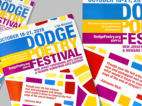
New Design for A Festival that Stays Fresh Every Year
501c Design excels at creating a core new visual brand identity that accurately reflects the organization – or in this case, event. For signature recurring events like the Dodge Festival, the brand foundation stays the same, but each year, a new motif keeps the design consistently fresh.
How?
The motif is always an illustrated, artistic graphic which gives the design its signature look. And since it is an illustration it can be manipulated to work in multiple sizes, media, and formats.
The typography stays the same year-to-year, unifying the design. Together, the style is immediately and uniquely recognizable as the Dodge Poetry Festival’s design.
Does your visual identity feel dated or stale? Let 501c Design give you a visual makeover! We can design materials that draw attention to your organization, all while allowing for creative updating and expanding as your organization grows and changes.
“Kerstin Vogdes Diehn is a phenomenal and creative designer who performs well under pressure and tight deadlines. We have been able to count on her for each Festival for her originality and cool and easy way of implementing these designs. Every Festival she continues to outdo herself!”
– Ysabel Gonzalez, Assistant Director, Dodge Poetry Program


